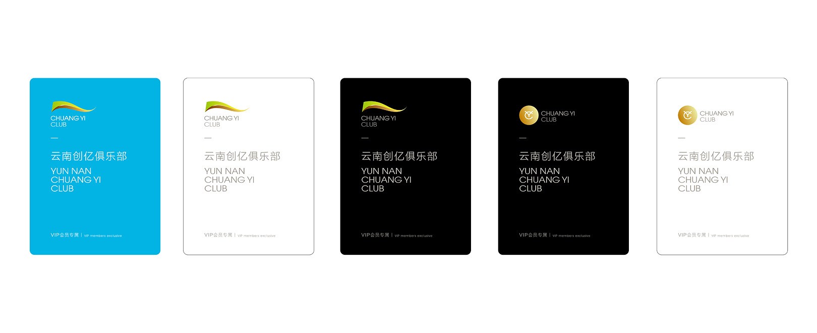
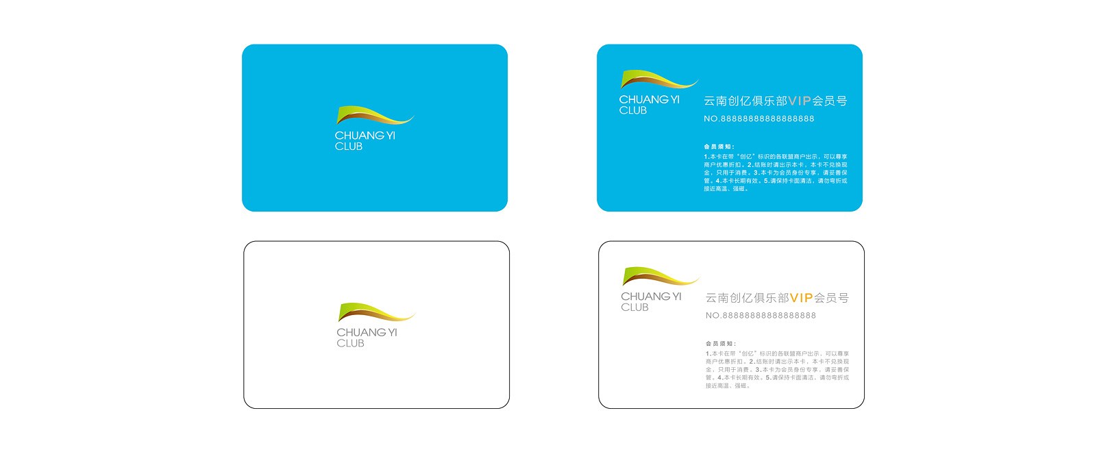
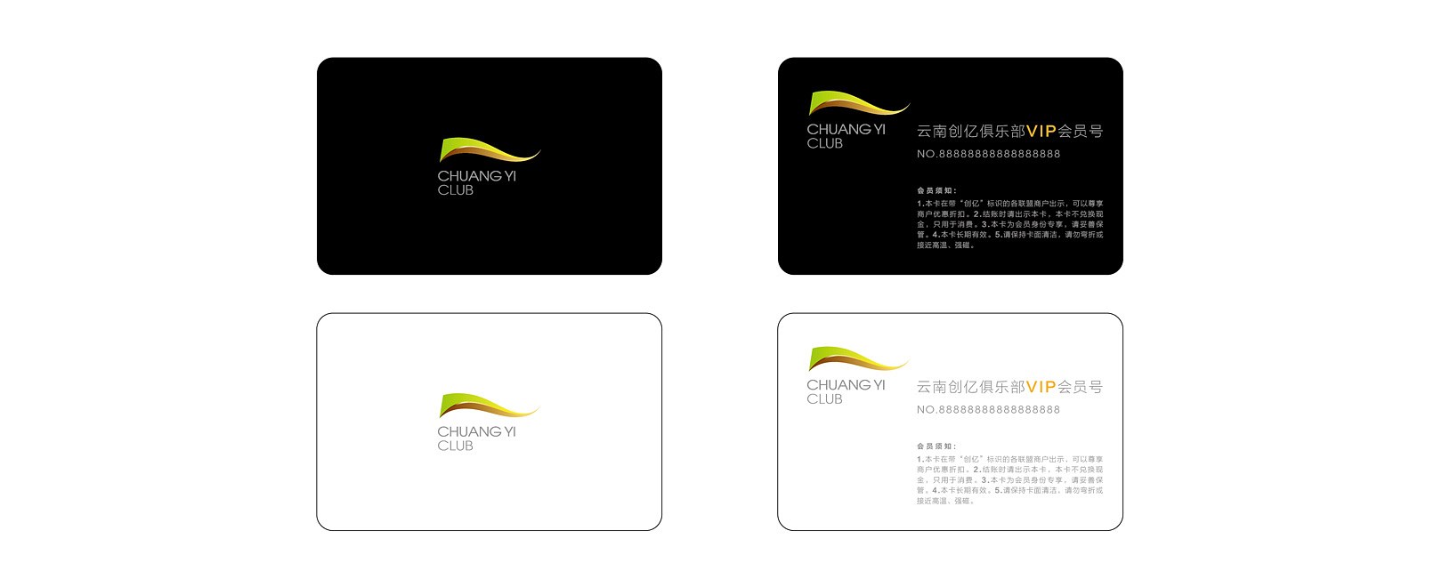
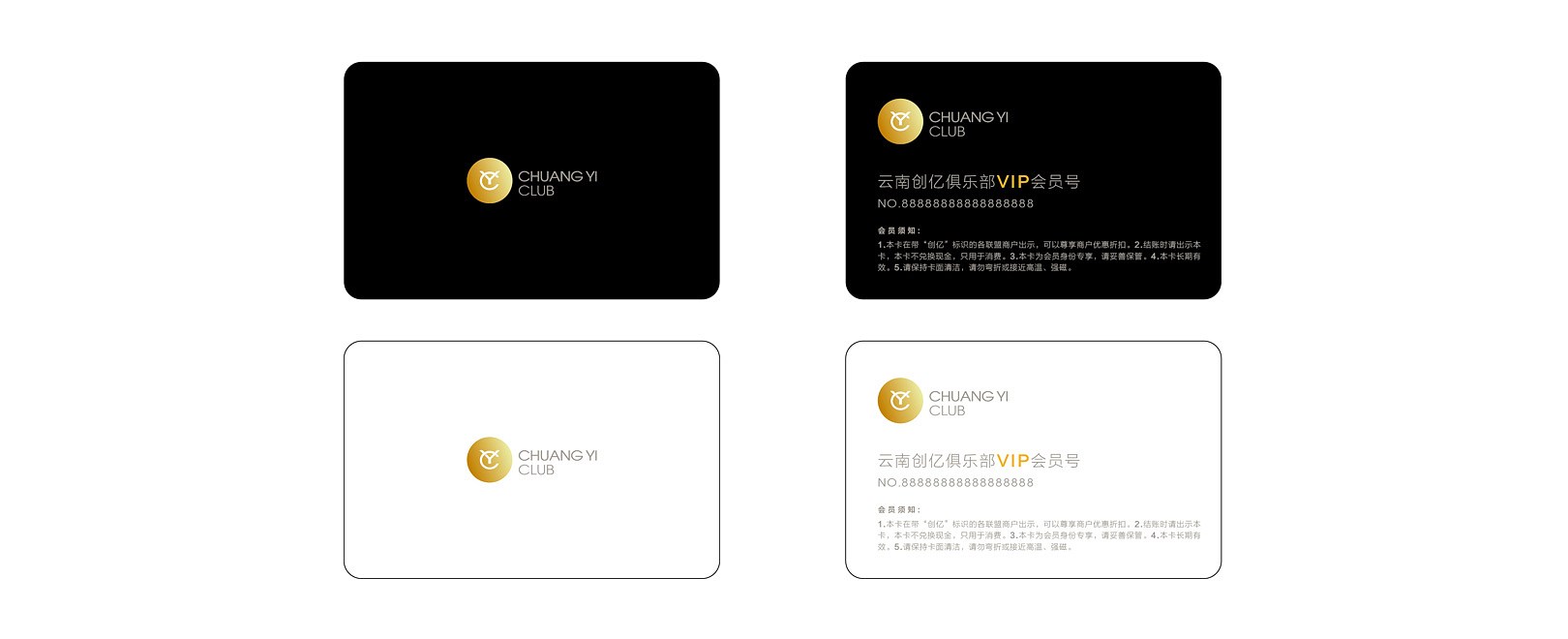
CHUAN YI CLUB
创亿俱乐部
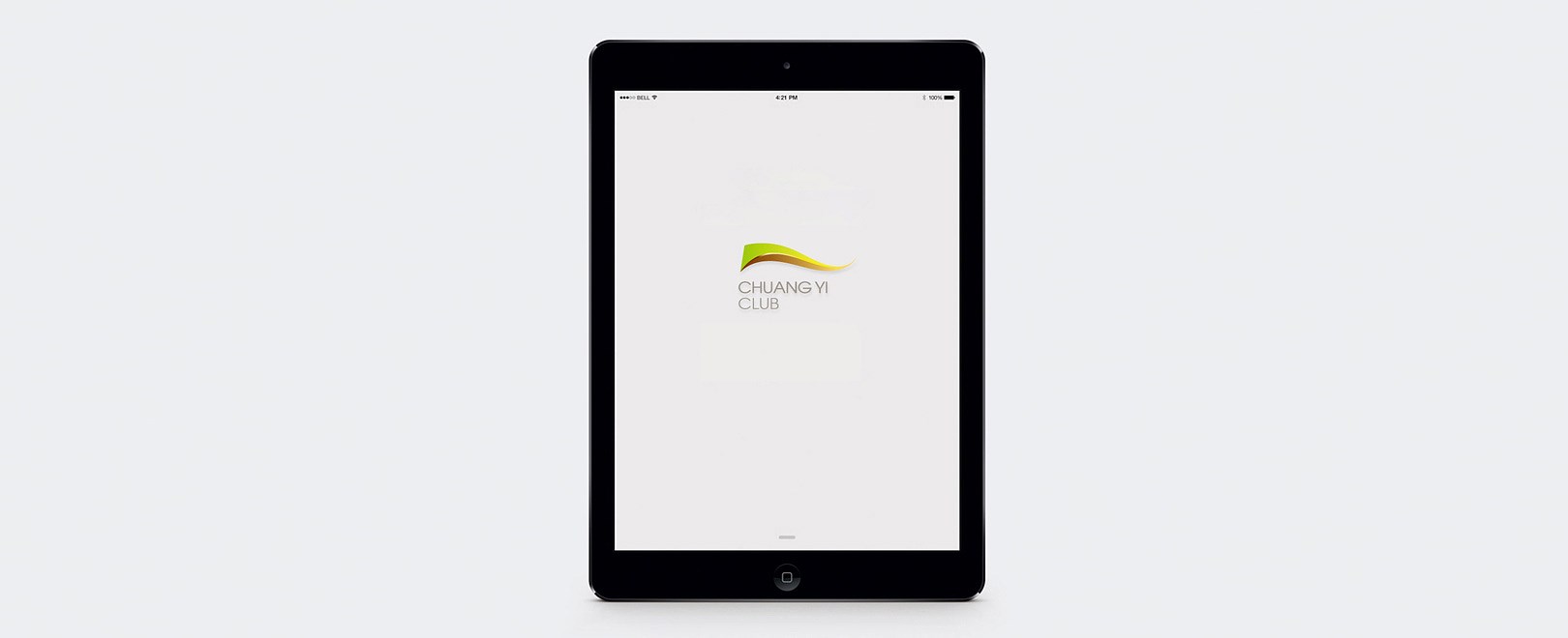
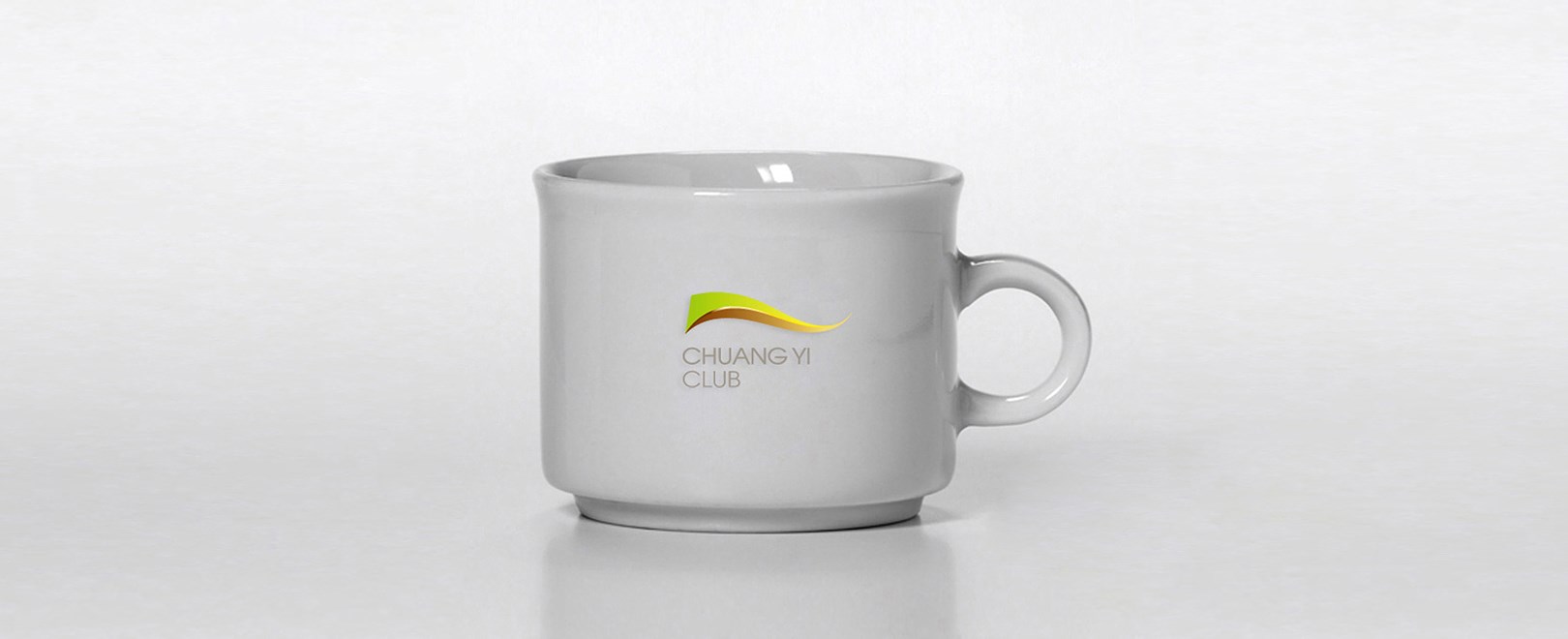
“创亿”是一个目标一种追求更是一种生活方式。标志主体由绿色渐变和金色渐变交织融合形成一面正在舞动的旗帜,绿色代表着我们追求健康的生活理念金色则寓意着财富,这与创亿俱乐部的宗旨不谋而合,飘舞、流畅的旗帜象征着我们的目标和梦想引领着俱乐部向着未来一路前行,而那优美的舞动则展示了我们所提倡的快乐的生活方式和健康的生活理念喻示着我们的生活每天都拥有无比的快乐和健康。绿色和金色的交汇处则代表着我们共同的生活理念和价值观,既完成了亿万家庭的健康目标也实现了我们共赢的收获。
创亿俱乐部品牌设计
“创亿”是一个目标一种追求更是一种生活方式。标志主体由绿色渐变和金色渐变交织融合形成一面正在舞动的旗帜,绿色代表着我们追求健康的生活理念金色则寓意着财富,这与创亿俱乐部的宗旨不谋而合,飘舞、流畅的旗帜象征着我们的目标和梦想引领着俱乐部向着未来一路前行,而那优美的舞动则展示了我们所提倡的快乐的生活方式和健康的生活理念喻示着我们的生活每天都拥有无比的快乐和健康。绿色和金色的交汇处则代表着我们共同的生活理念和价值观,既完成了亿万家庭的健康目标也实现了我们共赢的收获。
The Design Solution
“17.5°” is used to describe the ideal RSS (Ratio of Sweet and Sour) in client’s orange and apple juices. We used a simple, bold, equal - width typography in order to better imprint and aesthetically ‘stabilise’ in the mind of the viewer the product name “17.5°”. The ideal balance conveyed by the RSS ratio pronounced with this number is extended to the balance of letters and the overall form. The Semi circle visualises the 0.5 part of this numeric index and ingredients proportion. If the name “17.5°” is triggering consumers' curiosity through abstraction and toward easy recollection, the design attempts to reinforce the process with the body and weight of a dominating logo. Clear pet material is used for the container so that the natural juice cover serves as the backdrop of the product name.

嘉华食品
JOY BAKERY
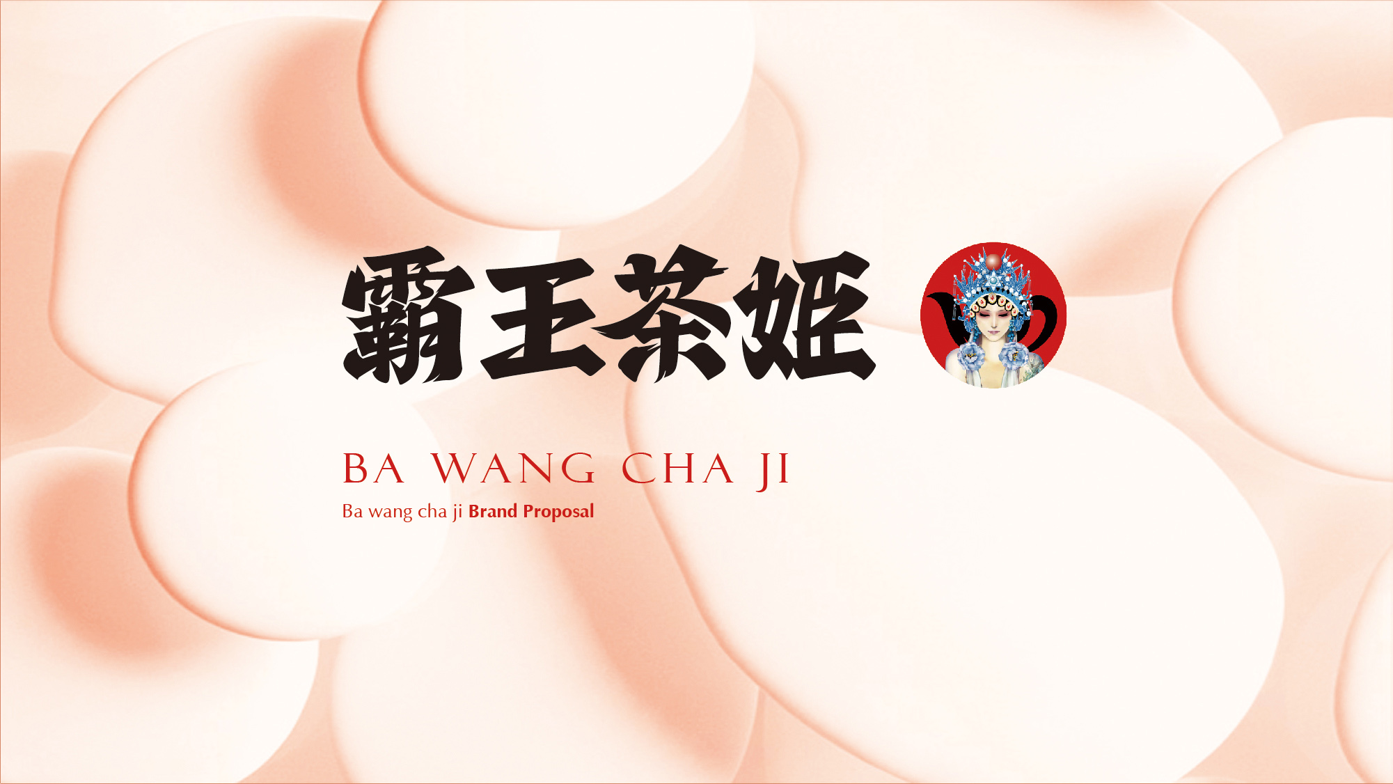
霸王茶姬
BA WANG CHA JI
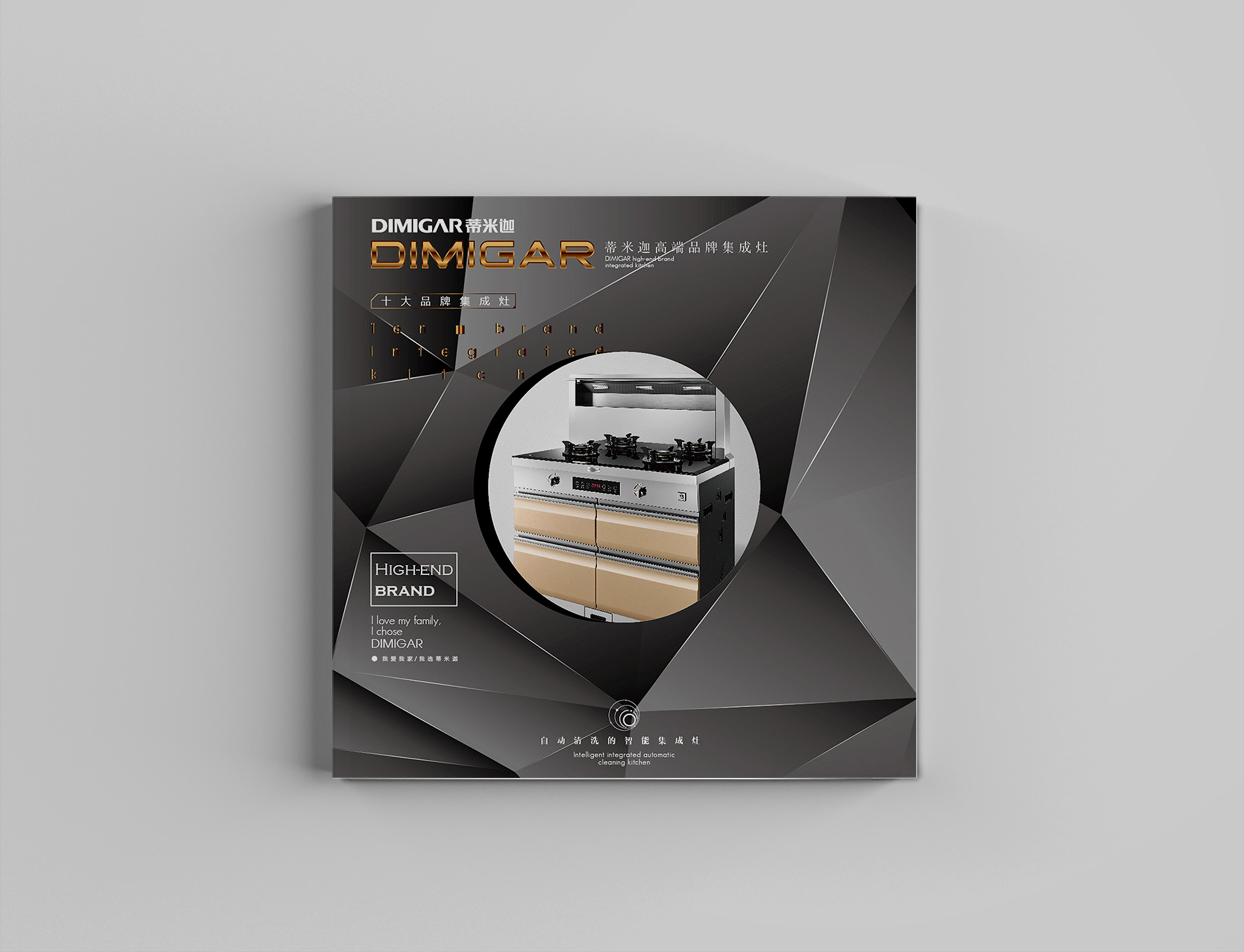
Kitchen stove brand design
企业品牌设计-厨灶品牌设计
Black zongzi of Mojiang river
墨江黑粽(实物展示)
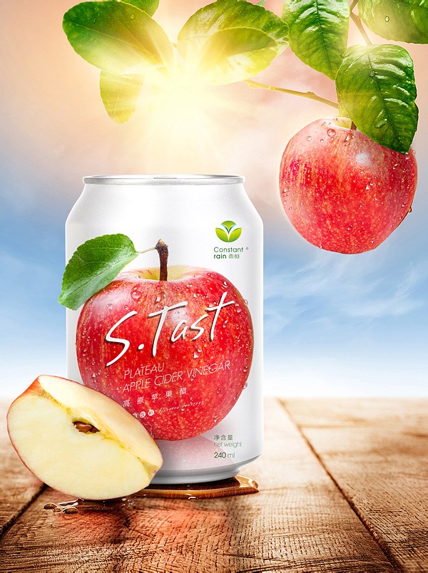
Highland Apple Cider Vinegar
高原苹果醋(品牌)
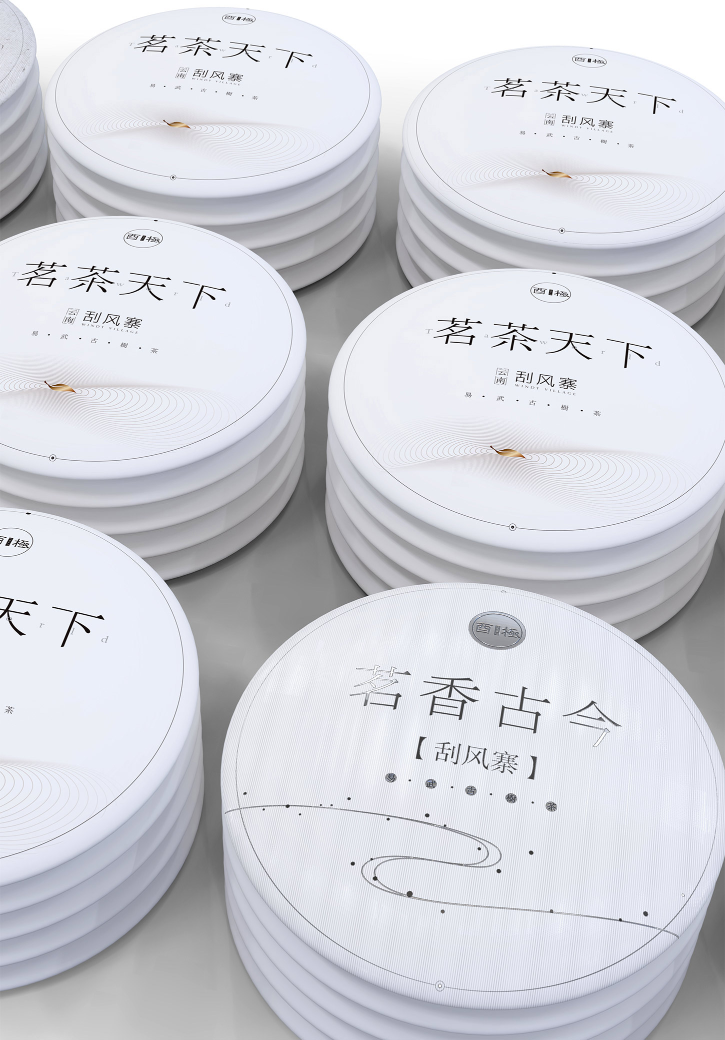
Bungee tea
台湾-酉极茶品牌
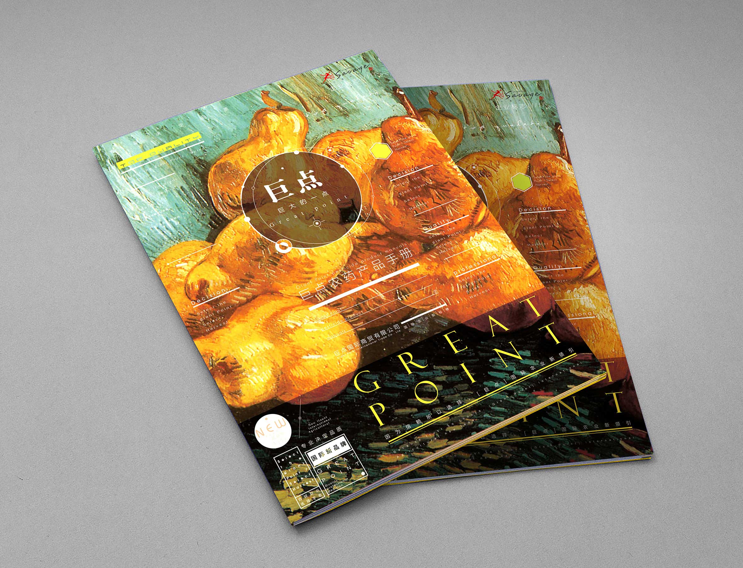
Huge points of agricultural trade
巨点农资品牌设计
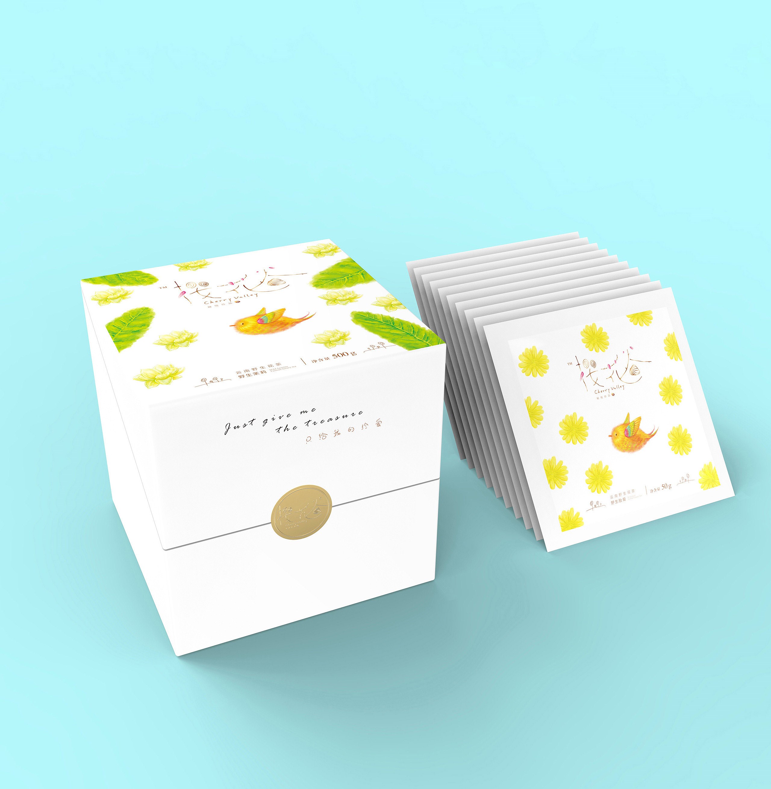
Cherry valley2
樱花谷(系列2)

Heilongjiang wuchang rice
黑龙江五常大米善田
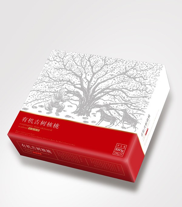
Dali Raus old tree walnut
拉乌古树核桃

Kunming Huadu Oceanarium
昆明花都海洋馆

FLYING CRANE MILK POWDER
飞鹤奶粉
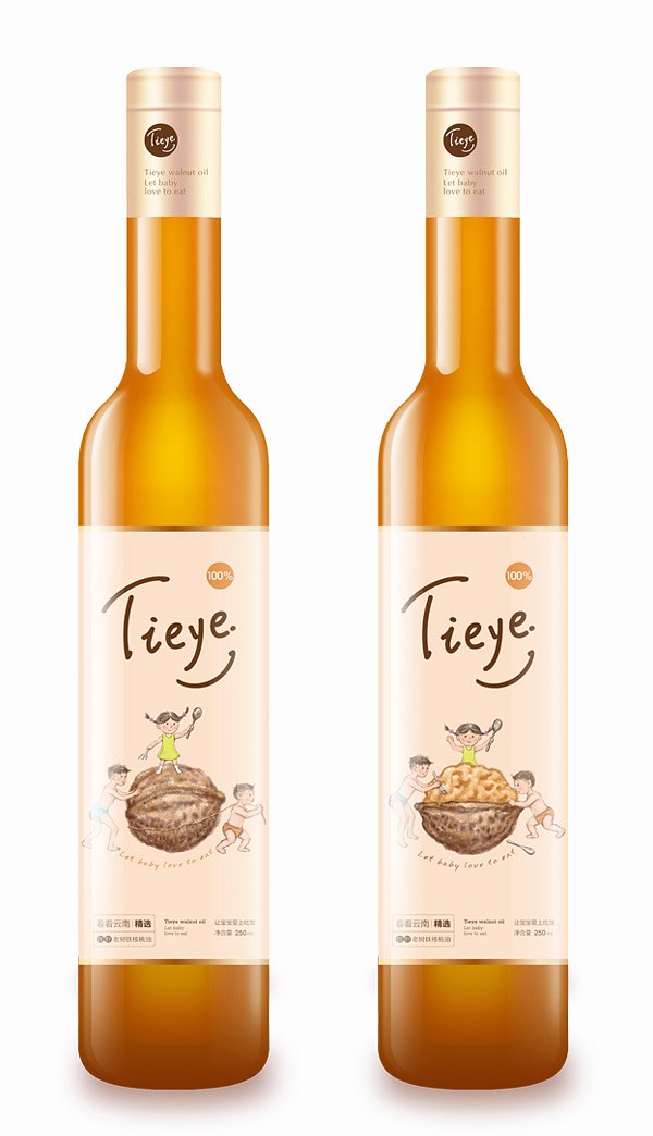
WALNUT OIL
紫江定制核桃油

Chu Orange Premium Drinks
褚橙高端饮品

CHUAN YI CLUB
创亿俱乐部

Songhe Wine Group
宋河酒业集团

QIN CHEN GRACE
沁晨品牌设计
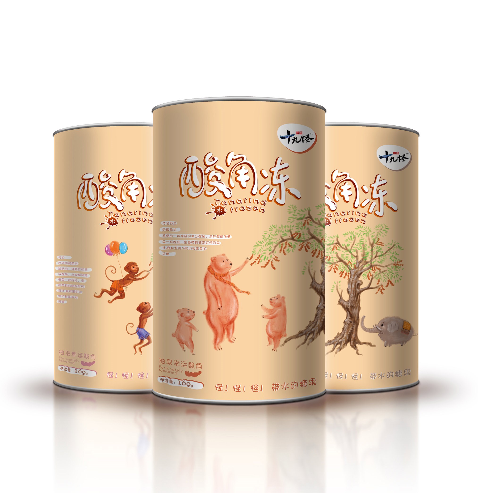
Yunnan ninety nine
云南十九怪酸角冻
Lian Chen Flowers Cake
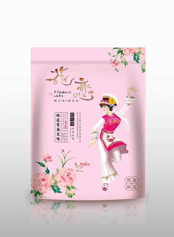
连宸鲜花饼(三)
Lian Chen Flowers Cake
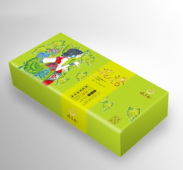
连宸鲜花饼(一)
Lian Chen Flowers Cake
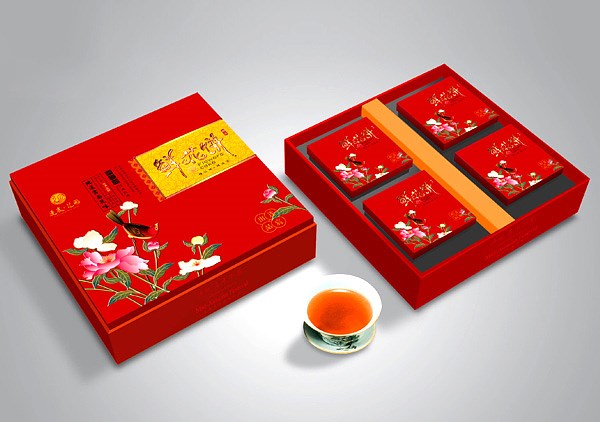
连宸鲜花饼(二)
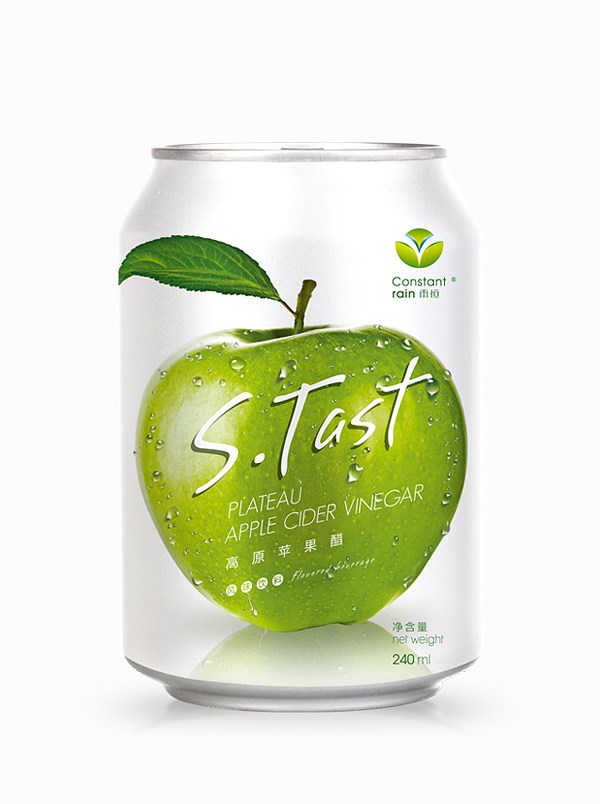
Highland Apple Cider Vinegar
高原苹果醋
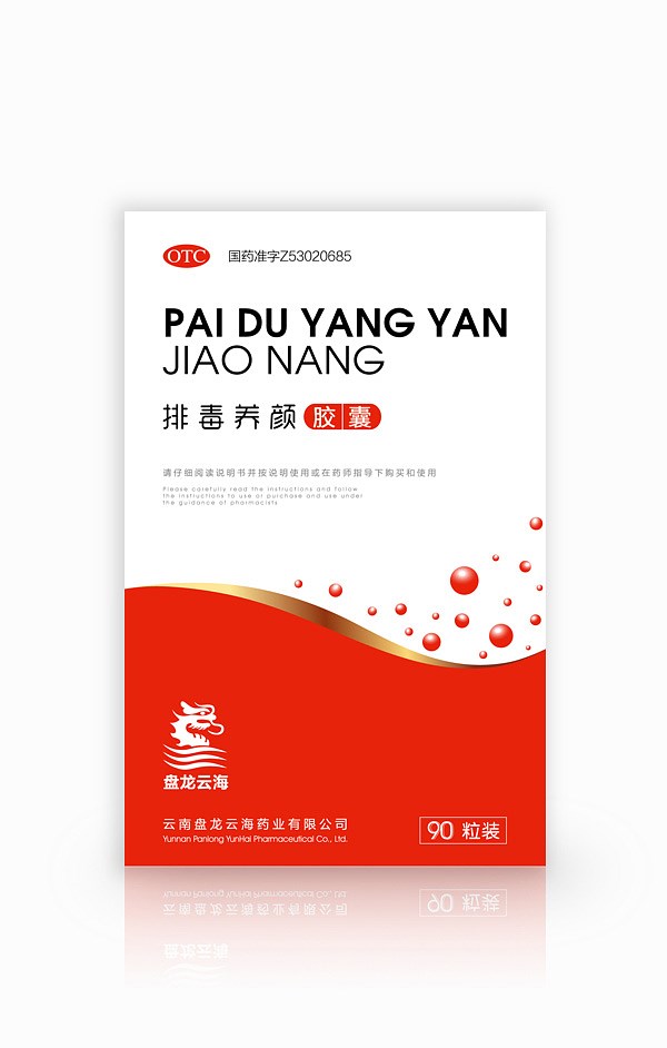
PAN LONG YUN HAI
盘龙云海排毒养颜胶囊

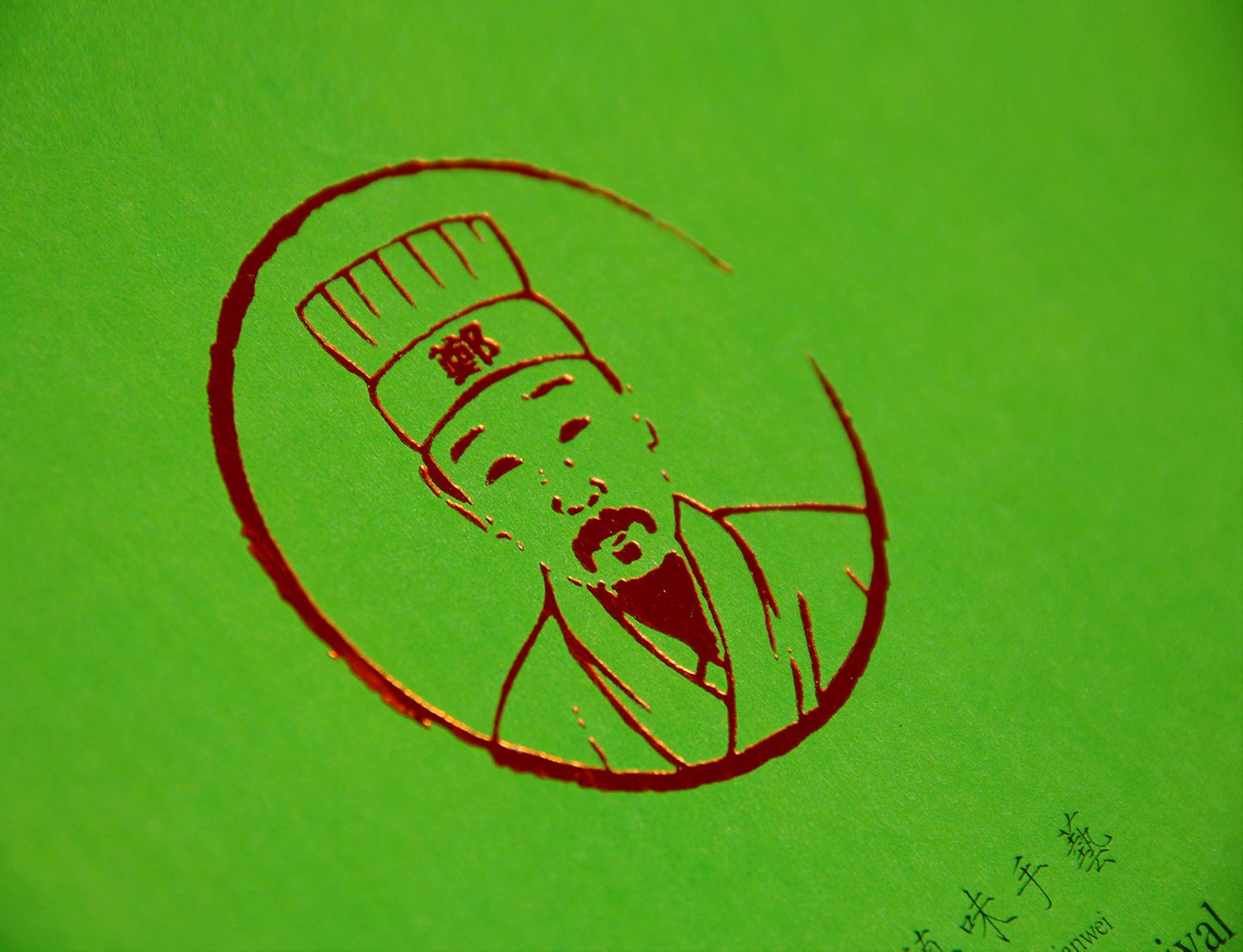
ZHENG DAO FU
郑道夫包装设计
扫描二维码分享到微信